Vintage War & Advertising Posters

The First World War produced the greatest concentration of poster art in history, and it happened because governments discovered they needed to persuade rather than order.
The mechanism was money. The war was funded by borrowing from ordinary citizens, which meant asking millions of people to hand over savings voluntarily. The United States ran four Liberty Loan drives and a Victory Loan, and each came with a poster campaign of a size never attempted before. The Division of Pictorial Publicity organized the illustrators, and the best commercial artists in the country worked without fee.
The volume is what separates this from every earlier propaganda effort. The United States alone printed something on the order of twenty million posters between 1917 and 1918 — more sheets than the country had adult citizens — and they went up in post offices, shop windows, railway carriages, factory canteens and school corridors.
The names are worth knowing because they were the top of their trade. James Montgomery Flagg produced the pointing Uncle Sam, adapting a British poster and using his own face for the model. Howard Chandler Christy drew the girls. Joseph Pennell showed New York in flames. Charles Dana Gibson ran the whole operation.
The European posters are a different animal and, to my eye, better. German designers had come out of the Munich commercial poster tradition, so Ludwig Hohlwein's war work has the same flat geometry and heavy shadow as his advertising for shoes and cigarettes. The French and Austrian loan posters are more painterly and more melancholy. The British recruiting posters are the most direct and the most manipulative.
The subjects go well beyond soldiers. Food conservation. War gardens. Red Cross nursing. Bond drives. Anti-waste campaigns. Warnings against loose talk. Appeals for the YMCA, the Salvation Army, war orphans and Belgian relief. A poster campaign reached into every part of civilian life because the war required every part of it.
There is a technical reason these look the way they do. Stone lithography rewards flat areas of unmixed color and firm outlines, and punishes gradation, so the whole visual language of the poster — the bold silhouette, the limited palette, the heavy lettering — comes out of what the printing process could actually do well.
The commercial advertising posters from the same decades sit naturally alongside them. Cappiello in Paris, Penfield and Bradley in America, Leyendecker everywhere — the same printing technology and often the same artists, selling bicycles and magazines instead of bonds.
The German and Austrian loan posters are worth seeking out for a reason beyond design. They were produced by a state that lost, so far fewer survive, and they were rarely collected in America afterward. A Kriegsanleihe poster in good condition is a genuinely uncommon object in a way that an equivalent Liberty Loan poster is not.
For anyone reading these, the visual argument is usually the interesting part. A recruiting poster rarely mentions the war directly. It shows a mother, or a burning building, or a girl in uniform, and lets the viewer complete the sentence.
The Studio Portraits of a Country That Had Just Learned to Photograph Itself


-

 Snapshots of the Past
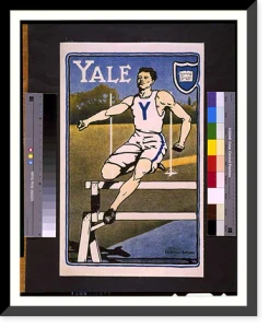
Vintage Poster Art - Yale. Bristow Adams - Antique Wall Decor Print
Drawn from the Library of Congress archive, this print depicts Yale. Bristow Adams. Classic. The Library holds one of the most comprehensive collections of American and international historical...$57.00 -
 Snapshots of the Past
Vintage Poster Art - United States official films shown here
Step back in time with this striking reproduction of United States official films shown here. The Hegeman Print N.Y. Sourced from the United States Library of Congress.Library of Congress record:...$57.00 -
 Snapshots of the Past
Vintage War Poster - Und Ihr Zeichnet 7. Kriegsanleihe. AR 17
Originally preserved in the Library of Congress, this print of Und Ihr? Zeichnet 7. Kriegsanleihe. AR 17 is now available for your home or office. The Library has preserved this image as part of its...$57.00 -
 Snapshots of the Past
Vintage War Poster - Two Marines. J.C. Leyendecker - Historic Wall Art Gift
This rare historical print captures Two Marines. J.C. Leyendecker in remarkable detail. Sourced directly from the Library of Congress, it represents an authentic piece of documented history.Library...$57.00 -
 Snapshots of the Past
Antique Poster Print - Thrift stamps - Antique Wall Decor Print
Originally preserved in the Library of Congress, this print of Thrift stamps. We licked them at the front you lick them at the back Classic is now available for your home or office. The Library has...$57.00 -
 Snapshots of the Past
Vintage Poster Art - Take up the sword of justice - Historic Wall Art Gift
Originally preserved in the Library of Congress, this print of Take up the sword of justice. B.P. printed by David Allen Sons Ld. Harrow Middlesex is now available for your home or office. The...$57.00 -
 Snapshots of the Past
Vintage War Poster - Souscrivez pour la victoire - Vintage Wall Art Gift
Drawn from the Library of Congress archive, this print depicts Souscrivez pour la victoire. Banque Nationale de Creacutedit. The Library holds one of the most comprehensive collections of American...$57.00 -
 Snapshots of the Past
Antique Poster Print - Remember! - Vintage Home Decor Print
Originally preserved in the Library of Congress, this print of Remember! is now available for your home or office. The Library has preserved this image as part of its permanent historical collection...$57.00 -
 Snapshots of the Past
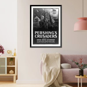
Vintage War Poster - Pershings crusaders - Historic Wall Art Gift
Step back in time with this striking reproduction of Pershings crusaders. Auspices of the United States government. The H.C. Miner Litho. Co. N.Y. Sourced from the United States Library of Congress...$57.00 -
 Snapshots of the Past
Vintage War Poster - Over there - U.S. Navy. Albert Sterner, 1917
Drawn from the Library of Congress archive, this print depicts Over there - U.S. Navy. Albert Sterner 1917. The Library holds one of the most comprehensive collections of American and international...$57.00 -
 Snapshots of the Past
Antique Poster Print - Keep em going!. Ketterlinus Phila
This rare historical print captures Keep em going!. Ketterlinus Phila in remarkable detail. Sourced directly from the Library of Congress, it represents an authentic piece of documented history...$57.00 -
 Snapshots of the Past
Vintage Poster Art - Journée de larmée dAfrique et des troupes
Originally preserved in the Library of Congress, this print of Journeacutee de larmeacutee dAfrique et des troupes coloniales is now available for your home or office. The Library has preserved this...$57.00